Website Redesign
Website Redesign for Luxe Skin Therapy
User experience testing revealed that Luxe Skin Therapy needed an overall clarification in branding elements and a more modern design. The old website had not been optimized for mobile users, making it appear overcrowded, and confusing navigation meant that customers could not always find products. The result was lower than hoped online sales.
The team began by conducting a heuristic analysis and meeting with business owner Shar to develop a comprehensive list of website rewrite and redesign needs in order to best tell her story and achieve her desired brand identity. Based on that inventory of needs, we proposed a full website redesign for both mobile and desktop. Shar provided access to rework her website (without publishing) so that both she and the team could see the design progress all the way through.
To help customers find products more easily, we developed a comprehensive product spreadsheet Shar could use to organize her products consistently and re-organized them throughout the site. We also developed promotional banner ideas for the home page, rewrote outdated content for several pages, and researched and wrote new content. For the new site, we used a leafy green color palette and updated visuals Shar liked from the old website to clean up the website without clearing it of Shar’s personality.
See the before and after of the website's Home page:

Shar Huff
Website Implementation for Farmacy Food
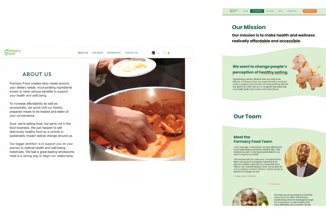
A previous student team of designers had proposed a new layout for Farmacy Food’s website, but it had not been implemented. Their website, like the other branding elements, did not connect to the audience nor communicate the team’s stories in a descriptive and inviting way.
After hearing the business’ feedback, the team made updates to the previous designs in order to incorporate the new visual and verbal identity which better conveys their welcoming approach to food. This included redesigning their health badges and ingredient illustrations in a style that resonated with Farmacy Food’s team, writing website copy with more engaging language, and integrating the narrative video on the homepage. By incorporating these new elements whilst following the update brand guide, the team was able to make the website more inviting and personal to the business' story.
Check out the before and after of the website's About page:


